居中和多列是我们在布局中非常常见的排版方式,它实现都有多种方案思路。
居中
水平居中的方案
首先是水平居中,在讲水平居中之前,我们先来准备一个父盒子container和一个可能会随内容变宽的子盒子box,parent和child用来控制水平居中。css-center-horizontal.html
1
2
3
4
5
6
7
8
9
10
11
12
13
14
15
16
17
18
19
20
| <style type="text/css">
.container {
width: 340px;
height: 100px;
background: #4a494a;
}
.box {
display: inline-block;
height: 100px;
line-height: 100px;
padding: 0 20px;
text-align: center;
font-size: 24px;
color: #fff;
background: #c8c7c8;
}
</style>
<div class="container parent">
<div class="box child"></div>
</div>
|
1、inline-block + text-align
1
2
3
4
5
6
| .parent {
text-align: center;
}
.child {
display: inline-block;
}
|
2、table + margin
1
2
3
4
| .child {
display: table;
margin: 0 auto;
}
|
1
2
3
4
5
6
7
8
| .parent {
posistion: relative;
}
.child {
position: absolute;
left: 50%;
transform: translateX(-50%);
}
|
4、flex + justify-content
1
2
3
4
| .parent {
display: flex;
justify-content: center;
}
|
5、flex + margin
1
2
3
4
5
6
| .parent {
display: flex;
}
.child {
margin: 0 auto;
}
|
垂直居中的方案
同样,我们先准备一个父盒子container和一个高度可能会随内容变高的子盒子box,parent和child来控制垂直居中。css-center-vertical.html
1
2
3
4
5
6
7
8
9
10
11
12
13
14
15
16
17
18
19
| <style type="text/css">
.container {
width: 100px;
height: 340px;
background: #4a494a;
}
.box {
display: inline-block;
width: 100px;
padding: 20px 0;
text-align: center;
font-size: 24px;
color: #fff;
background: #c8c7c8;
}
</style>
<div class="container parent">
<div class="box child"></div>
</div>
|
1、table-cell + vertical-align
1
2
3
4
| .parent {
display: table-cell;
vertical-align: middle;
}
|
1
2
3
4
5
6
7
8
| .parent {
display: relative;
}
.child {
position: absolute;
top: 50%;
transform: translateY(-50%);
}
|
3、flex + align-items
1
2
3
4
| .parent {
display: flex;
align-items: center
}
|
水平垂直居中的方案
而水平垂直居中其实就是把前面的水平居中和垂直居中融合起来。一样,我们先来准备一个父盒子parent和一个宽度和高度可变的子盒子child。css-center-both.html
1、inline-block + text-align + table-cell + vertical-align
1
2
3
4
5
6
7
8
| .parent {
display: table-cell;
text-align: center;
vertical-align: middle;
}
.child {
display: inline-block;
}
|
1
2
3
4
5
6
7
8
9
| .parent {
position: relative;
}
.child{
position: absolute;
left: 50%;
top: 50%;
transform: translate(-50%, -50%);
}
|
3、flex + justify-content + align-items
1
2
3
4
5
| .parent {
display: flex;
justify-content: center;
align-items: center;
}
|
多列
在讲多列布局之前,我们先拿左右两列布局举例。
定宽 + 自适应

是指一列定宽,另一列自适应父元素宽度。css-columns-type1.html
1
2
3
4
5
6
7
8
9
10
11
12
13
14
15
16
17
18
19
20
21
22
| <style type="text/css">
.parent {
width: 400px;
color: #fff;
font-size: 24px;
}
.left div {
background: #666;
}
.right div {
background: #999;
}
</style>
<div class="parent">
<div class="left">
<div>left</div>
</div>
<div class="right">
<div>right</div>
<div>right</div>
</div>
</div>
|
1、float + margin
1
2
3
4
5
6
7
| .left {
float: left;
width: 100px;
}
.right {
margin-left: 110px;
}
|
2、float + overflow
1
2
3
4
5
6
7
8
| .left {
float: left;
width: 100px;
margin-right: 10px;
}
.right {
overflow: hidden;
}
|
这里涉及到了BFC原理,overflow:hidden可以触发形成BFC,而BFC的元素不会和float的元素发生重叠。题外话,我们经常遇到相邻元素margin重叠的问题,我们可以让其中一个元素overflow:hidden取消margin重叠。
3、table
1
2
3
4
5
6
7
8
9
10
11
| .parent {
display: table;
table-layout: fixed;
}
.left, .right{
display: table-cell;
}
.left {
width: 100px;
padding-right: 10px;
}
|
4、flex
1
2
3
4
5
6
7
8
9
10
| .parent {
display: flex;
}
.left {
width: 100px;
margin-right: 10px;
}
.right {
flex: 1;
}
|
上面讲的都是一列定宽+自适应,那么两列定宽(三列定宽、四列定宽…)+自适应,也是同理,凡是定宽的就和第一列定宽差不多的写法,多了一点代码而已。css-columns-type2.html
不定宽 + 自适应

1、float + overflow
1
2
3
4
5
6
7
| .left {
float: left;
margin-right: 10px;
}
.right {
overflow: hidden;
}
|
2、table
1
2
3
4
5
6
7
8
9
10
| .parent {
display: table;
}
.left, right {
display: table-cell;
}
.left {
width: 1px;
padding-right: 10px;
}
|
3、flex
1
2
3
4
5
6
7
8
9
| .parent {
display: flex;
}
.left {
margin-right: 10px;
}
.right {
flex: 1;
}
|
如果是多列不定宽+自适应,也是同理,不定宽的列不设定死宽度就可以了,宽度由里面内容的宽度来决定。
等宽
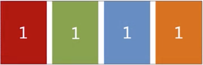
这里的N个列等宽不是说给每一列都设定死一个相同的宽度,而是随父元素的宽度变化自动均等分配所有的横向空间。我们先准备一下HTML结构。css-columns-type3.html
1
2
3
4
5
6
| <div class="parent">
<div class="child"><div>1</div></div>
<div class="child"><div>2</div></div>
<div class="child"><div>3</div></div>
<div class="child"><div>4</div></div>
</div>
|
1、float?
父元素宽 + 左间距 =(列宽 + 左间距)* 列数,这个方案我们是需要知道固定是多少列的。
1
2
3
4
5
6
7
8
9
| .parent {
margin-left: -20px;
}
.child {
float: left;
width: 25%;
padding-left: 20px;
box-sizing: border-box;
}
|
那么,在不知道有多少列的情况下,怎么办呢?
2、table
结果上做个调整,外面套多一层div
1
2
3
4
5
6
7
8
| <div class="parent-fix">
<div class="parent">
  <div class="child"><div>1</div></div>
  <div class="child"><div>2</div></div>
  <div class="child"><div>3</div></div>
  <div class="child"><div>4</div></div>
</div>
</div>
|
1
2
3
4
5
6
7
8
9
10
11
12
| .parent-fix {
margin-left: -20px;
}
.parent {
display: table;
width: 100%;
table-layout: fixed;
}
.child {
display: table-cell;
padding-left: 20px;
}
|
3、flex
1
2
3
4
5
6
7
8
9
| .parent {
display: flex;
}
.child {
flex: 1;
}
.child + .child {
margin-left: 20px;
}
|
等高
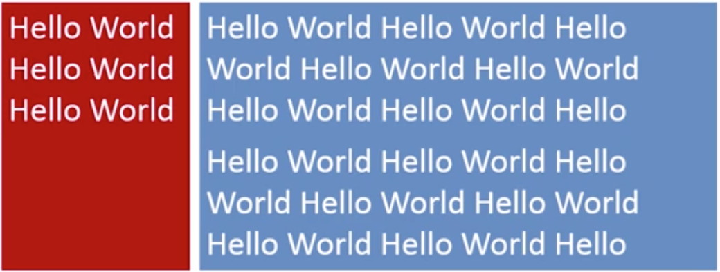
等高布局意思是说,在多列的情况下,其中一列的高度变高,另外的列的高度也随着变到一样高。css-columns-type4.html
我们先准备一个两列结构
1
2
3
4
5
6
7
8
9
10
11
12
13
14
15
16
17
| <style>
.left {
background: #666;
}
.right {
background: #999;
}
</style>
<div class="parent">
<div class="left">
<div>left</div>
</div>
<div class="right">
<div>right</div>
<div>right</div>
</div>
</div>
|
1、table
1
2
3
4
5
6
7
8
9
10
11
12
13
| .parent {
display: table;
width: 100%;
table-layout: fixed;
}
.left, .right {
display: table-cell;
}
.left {
width: 100px;
border-right: 10px solid transparent;
background-clip: padding-box;
}
|
2、flex
1
2
3
4
5
6
7
8
9
10
| .parent {
display: flex;
}
.left {
width: 100px;
margin-right: 20px;
}
.right {
flex: 1;
}
|
这个和之前我们定宽+自适应的代码是一样的,不一样的地方是,之前背景色设置到left和right里面的div,而这里我们把背景色设置在了left和right上,但是其实left和right背后的高度是一样的,是利用了flex因子的对齐方式align-items的默认值是stretch(拉伸)来决定的。
3、float
1
2
3
4
5
6
7
8
9
10
11
12
13
14
15
| .left {
float: left;
width: 100px;
margin-right: 20px;
}
.right {
overflow: hidden;
}
.left, .right {
padding-bottom: 9999px;
margin-bottom: -9999px;
}
.parent {
overflow: hidden;
}
|


